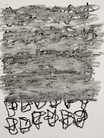
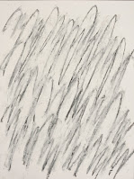
Nine Drawings (out of 20), 2021
Each: graphite or conté and oil pastel on paper, 12.5" x 9.5"
One day recently, I went on a drawing spree. I completed twenty drawings during an afternoon while also watching video profiles of various artists. I don't recall all of them, and I'm sure that there were a couple of repeats, but I often enjoy watching videos when not listening to music or podcasts while working in the studio. This particular afternoon, I wasn't in the mood to paint and remembered that I had this pad of nice, smooth white paper made by Fabriano and that I had a bunch of oil pastels that hadn't been used in years, so that was it, a drawing day it was. I made some drawings back in 2004 or so where I used graphite with colorless and white oil pastels that turned out really well. I wanted to see what could happen using those same materials with my glyph images.
The types of mark making that can happen when dragging the colorless or white oil pastels across soft graphite or conté was interesting to see. The blurriness and break down of the original drawing does something for me and I can't quite put it into words. I think it may have to do with altering the drawing in such a way that it begins to take on a different shape and appears to be morphing as I'm manipulating the oil pastels. The drawing seems to be in a state of flux, receding and advancing out from the paper all at once. If I cover the drawing with thicker layers or darker colors, the drawing gets buried under a confluence of marks. I'm always debating how much of the original drawing to leave visible. I'll start covering it up from the middle or one side and work my way across it from there. Determining where to stop the over drawing is always the interesting part. I like pushing the marks to the very edges of the glyph grid and figuring out how much of the glyphs to leave and where to cover them up entirely.
I'm not sure where these will lead next. I've already made some on larger paper (22" x 30") and the results were pretty cool. However, the surface of the larger paper has a mild cold-press feel to it and even though it's a shallow texture, I'm not entirely satisfied with the results. I'm going to look for sheets of smooth paper that's at least 140lbs. A hot press watercolor paper will work, I'm sure. In the meantime, I think there's a lot to experiment with on the smaller sized paper. The 12.5" x 9.5" size feels really good, so I'll probably continue with more of these drawings at this scale. Maybe make enough to fill up a good sized wall.
TM


No comments:
Post a Comment